The Power of Owning a Colour.
I recently saw David Beckham talking about Inter Miami and their relationship with pink.
His point was simple, but it stuck with me: Inter Miami owns pink.
And when you think about it, that’s quite a statement in football.
Look at the landscape. Red shirts. Blue shirts. More red. More blue. A bit of white. Maybe Tangerine if someone is feeling adventurous.
Football is full of brands competing within an incredibly narrow visual vocabulary.
Then Inter Miami arrives in pink.
Suddenly, you don’t need to see the badge.
You don’t necessarily need to see the players.
You can see a flash of pink in a crowd, on a billboard, on a shirt, across your social feed — and you know exactly who it belongs to.
That’s the power of owning a colour.

Image Credit: Max Amato
Colour can become a shortcut to a brand
The best brand assets work as shortcuts.
The Nike swoosh can work without the word Nike.
The Cadbury purple can work without the word Dairy Milk.
And Inter Miami’s pink is increasingly doing the same thing.
That’s when colour moves beyond being part of an identity system and starts becoming brand equity.
It becomes something people recognise, remember and associate with you.
The colour isn't decoration.
The colour is the brand.
And that matters even more when everyone else looks the same
This is where things get interesting.
Most categories have visual conventions.
Banks like blue.
Technology companies like blue.
Professional services love blue.
Football teams are red or blue.
Supermarkets are red, blue, orange or green.
Insurance companies tend towards reassuring blues.
The problem is that conventions are useful for the category — but they aren't necessarily useful for the individual brand.
If everyone is communicating with the same visual signals, those signals stop helping you stand apart.
This is why Monzo is such an interesting example.
When Monzo entered banking, it didn't look like a traditional bank.
And it certainly didn't behave like one visually.
The hot coral card became an immediate piece of brand recognition in a category dominated by more conservative colours.
You could be standing in a pub and see someone pull a bright coral card from their wallet.
You know what it is.
That is an incredibly valuable thing for a brand.
Recognition without explanation.
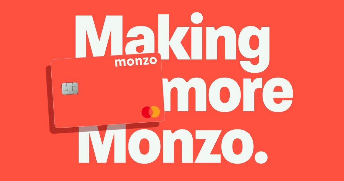
Image Credit: Ragged Edge
The colour becomes a piece of the product
There’s another reason Monzo is particularly clever.
The colour wasn't confined to advertising.
It was in your hand.
You carried it around.
You put it on the counter.
You saw it every time you paid.
Other people saw it too.
The brand became a physical object moving through the world.
And that creates something traditional advertising struggles to manufacture: organic visibility.
The same principle applies to Inter Miami.
The pink isn't just on a logo.
It's on shirts, scarves, stadium graphics, social content, merchandise, sponsorship activations and increasingly the visual language surrounding the club.
The colour travels.
And every time it does, it reinforces the association.
Pink → Inter Miami.
Coral → Monzo.
Purple → Cadbury.
Brown → UPS.
The fewer steps required for someone to make that mental connection, the stronger the brand asset becomes.
Brown isn't boring. Just ask UPS.

Image Credit: NY Times
If you'd told a branding team that one day brown would become a distinctive brand colour, they might have looked at you strangely.
Brown isn't usually the first colour that comes to mind when you're trying to build excitement.
But UPS has made it work.
The company's brown has been part of its identity for more than a century, originally chosen for practical reasons. Over time, that functional choice became something much more valuable: recognition.
You see a brown delivery van and you know what it is.
You don't necessarily need the logo.
You don't need the name.
The colour, combined with the shape and context, does a huge amount of the work.
And that's an important lesson.
You don't need the most exciting colour. You need a distinctive association.
UPS didn't win by choosing the loudest colour in the category.
It won by being consistent enough that brown became theirs.
That's the difference between choosing a colour and building a brand asset.
The opportunity isn't always to find a new colour
This doesn't mean every brand needs to go out and find the most outrageous colour imaginable.
That's not the point.
The opportunity is to ask a more uncomfortable question:
What visual territory can we credibly own that our competitors can't?
Sometimes that might be colour.
Sometimes it's typography.
A particular shape.
A photographic style.
A sonic identity.
A pattern.
A tone of voice.
Or a combination of several.
But colour is particularly powerful because it is processed incredibly quickly.
You don't have to read it.
You don't have to understand it.
You just have to see it.
Breaking category conventions can create disproportionate recognition
This is why I think Inter Miami is such a useful case study for brands outside sport.
They didn't just create a pink football identity.
They created a football identity that looked unlike the expected version of a football identity.
And that distinction matters.
If you're launching another red football team, you're immediately asking people to differentiate you from a huge number of existing visual associations.
If you're launching another blue bank, another blue technology platform or another blue consultancy, you're starting from a position of familiarity — but not necessarily distinctiveness.
There is a difference between looking credible for your category and being recognisable within it.
The first gets you in the game.
The second gets you remembered.
But owning a colour takes discipline
You can't simply pick a colour on Tuesday and expect to own it by Friday.
Brand recognition is built through repetition.
The colour needs to appear consistently and meaningfully across the experience.
It needs to become associated with something distinctive about the brand itself.
And, crucially, it needs enough space to breathe.
If your identity has twelve colours, five typefaces, three illustration styles and a different art direction every six months, it's difficult for any single asset to accumulate meaning.
Distinctive brands tend to have a hierarchy.
They know what their hero assets are.
They know what needs to be consistent.
And they know where they can flex.
That's what makes brands like Monzo, Cadbury, UPS and Inter Miami so interesting.
They may all use colour very differently, but they've each created a strong enough association that the colour itself starts doing some of the work of the brand.
So, what colour could your brand own?
This is one of the questions I increasingly think brands should be asking themselves.
Not:
What colour do we like?
Not:
What colour does our competitor use?
And not even:
What colour communicates trust?
But:
What colour could become unmistakably ours?
Because the goal of branding isn't simply to look good.
It's to become recognisable.
And in a world where every category is becoming more crowded, more competitive and increasingly visually similar, that recognition is incredibly valuable.
Inter Miami didn't invent pink.
Monzo didn't invent coral.
Cadbury didn't invent purple.
UPS certainly didn't invent brown.
But they each built a world where their particular expression of that colour became a shortcut to the brand.
That's the real opportunity.
The goal isn't to find a colour nobody else uses.
It's to make a colour nobody else can use without reminding people of you.
