Content today sits between two competing extremes. Independent creators and emerging studios move quickly, producing ideas with energy and personality, but often lack the brand authority to be taken seriously at an industry level.
BISON needed a brand with the authority to carry them. The studio had built a strong proposition around giving founders, creators and industry voices a place to record, create and share their thinking.

The challenge was to reposition BISON as a confident content brand capable of operating alongside the people shaping industry.
The people who book BISON bring the ideas, stories, opinions and thought leadership. BISON provides the environment and expertise to capture them and release them into the world.
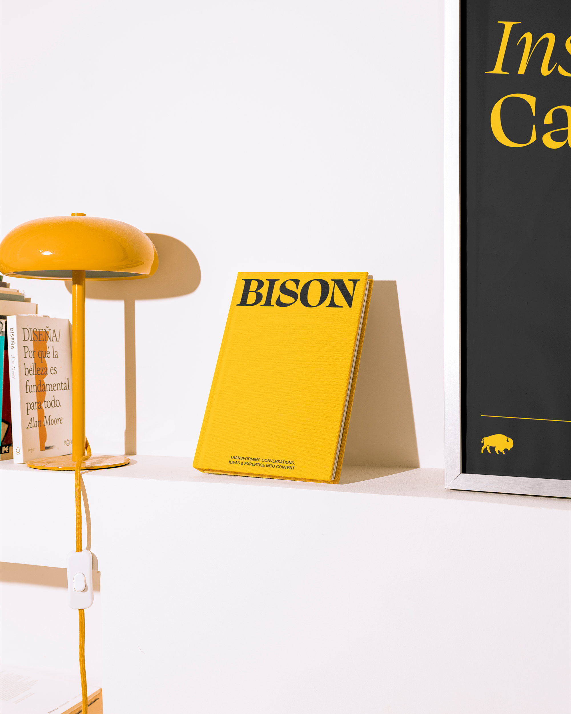
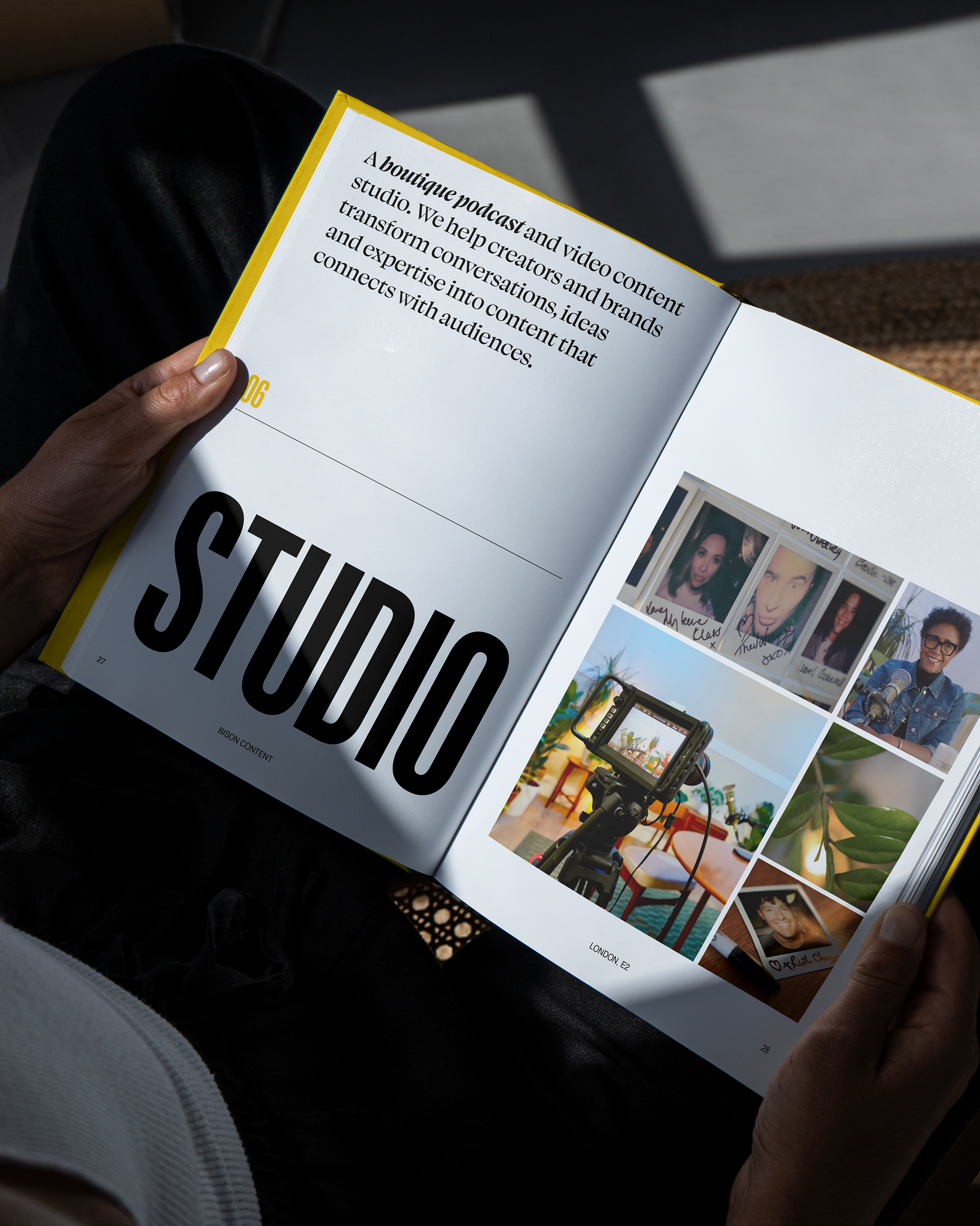
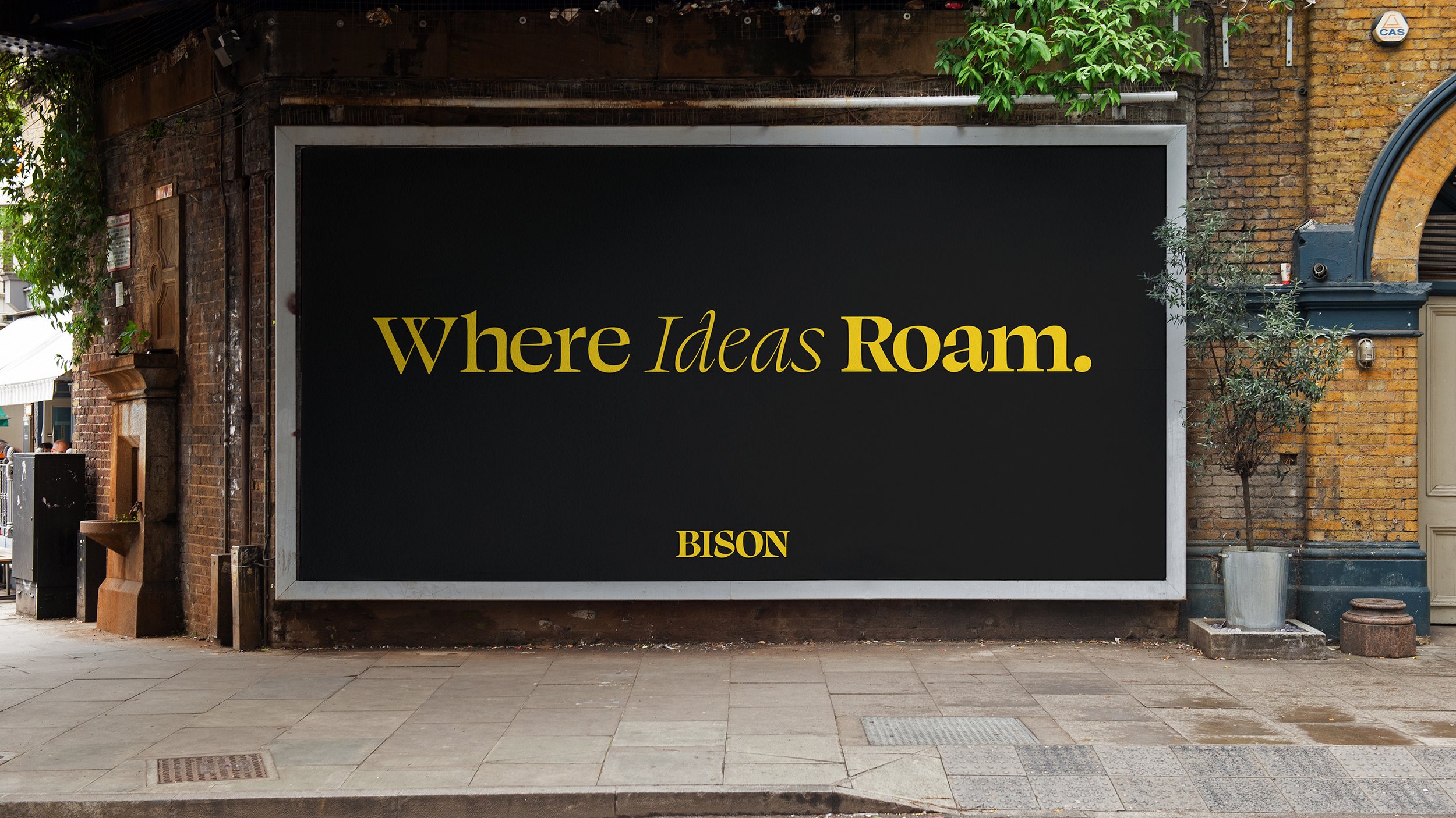
The identity was designed to give BISON presence without overpowering the content.
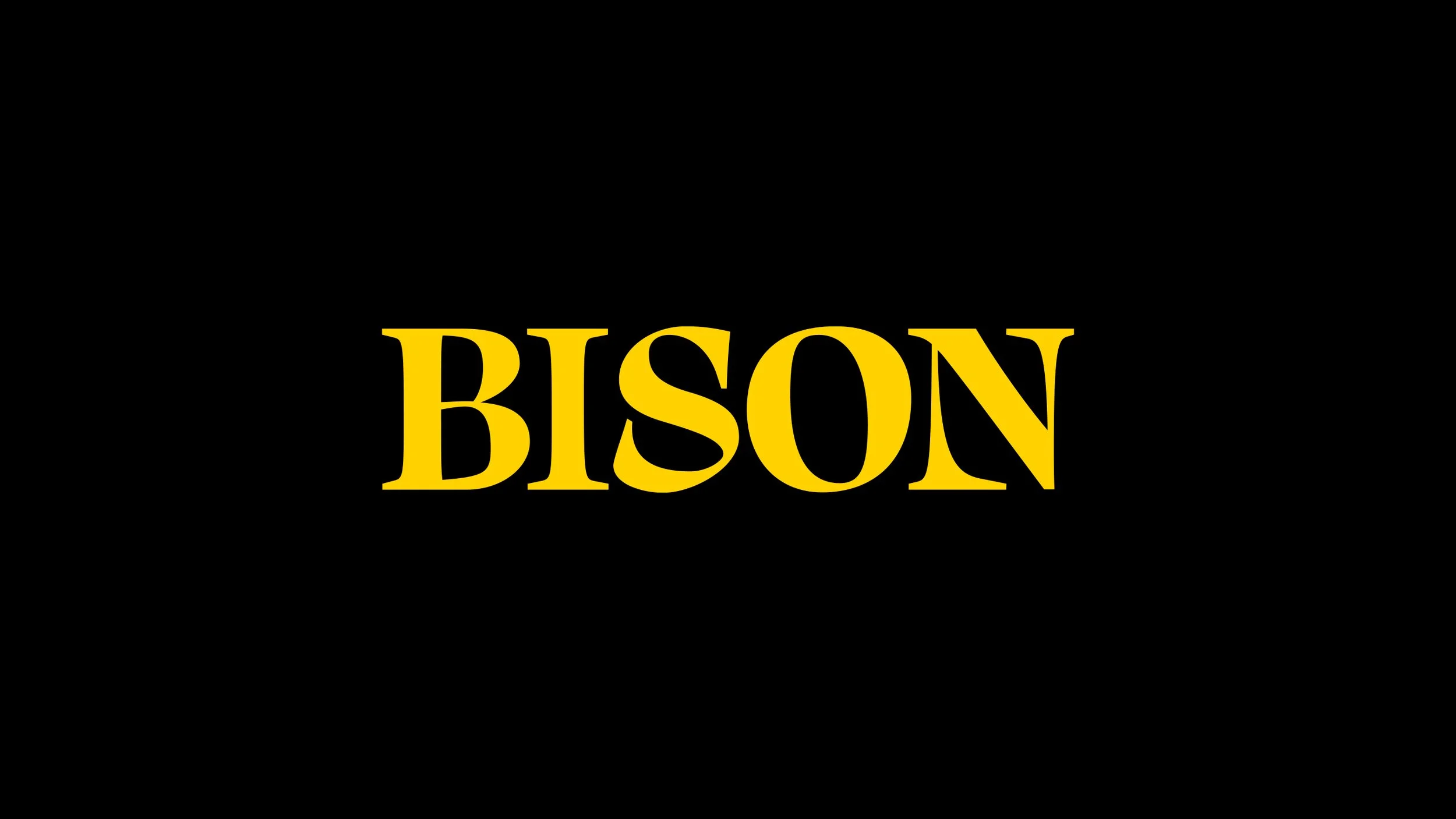
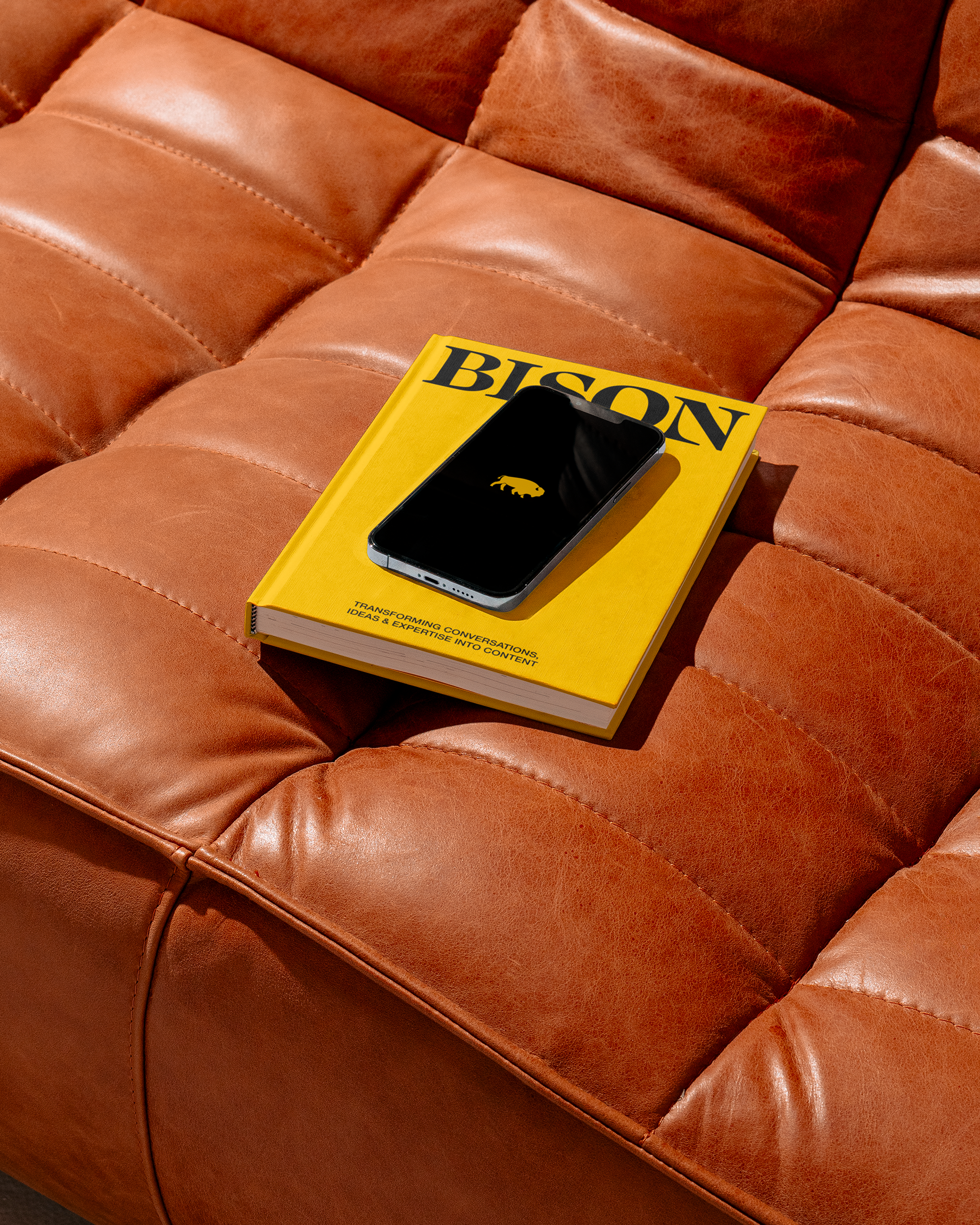
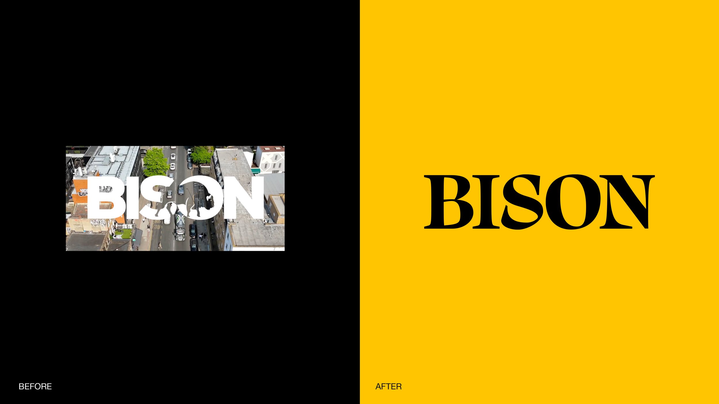
A bespoke wordmark combines sharp, editorial letterforms with subtle horn-inspired details, while bold typography, generous negative space and a striking yellow and black palette create immediate recognition.
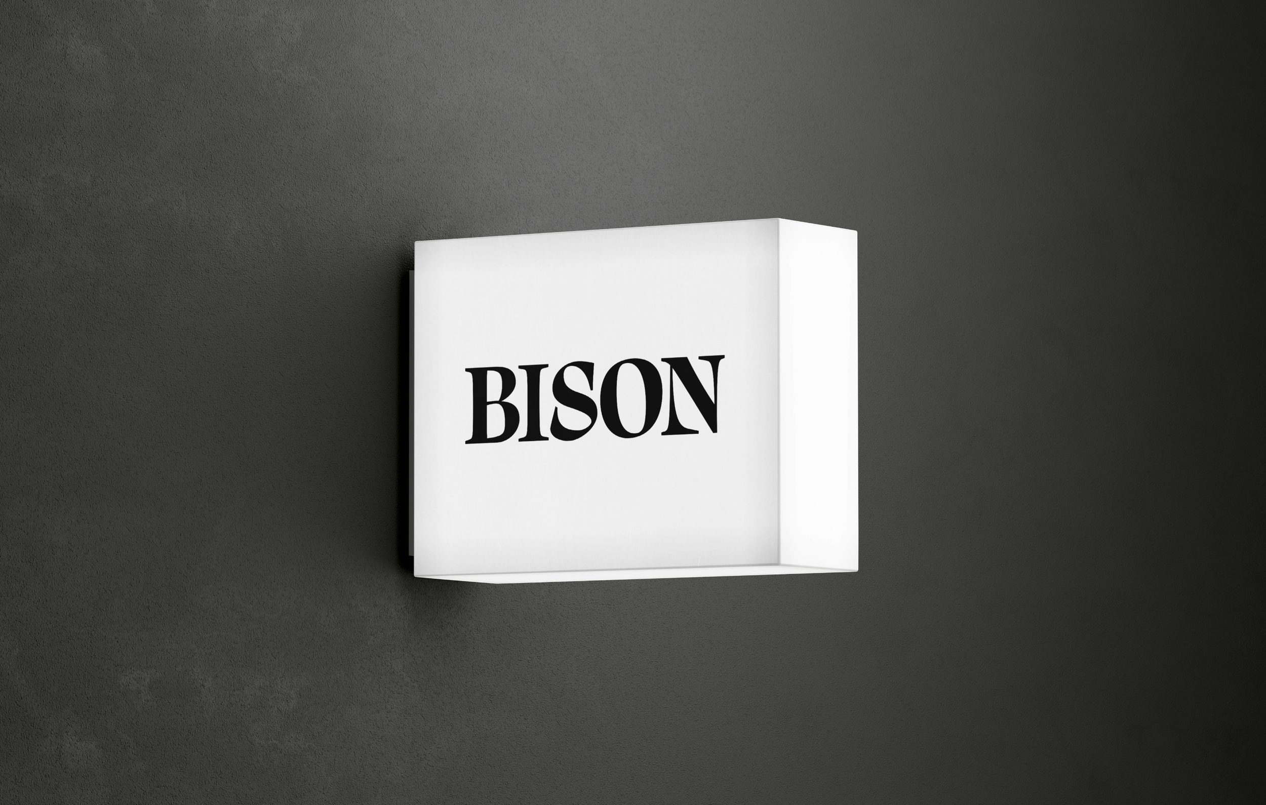
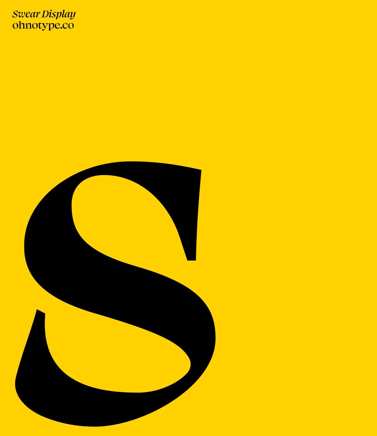
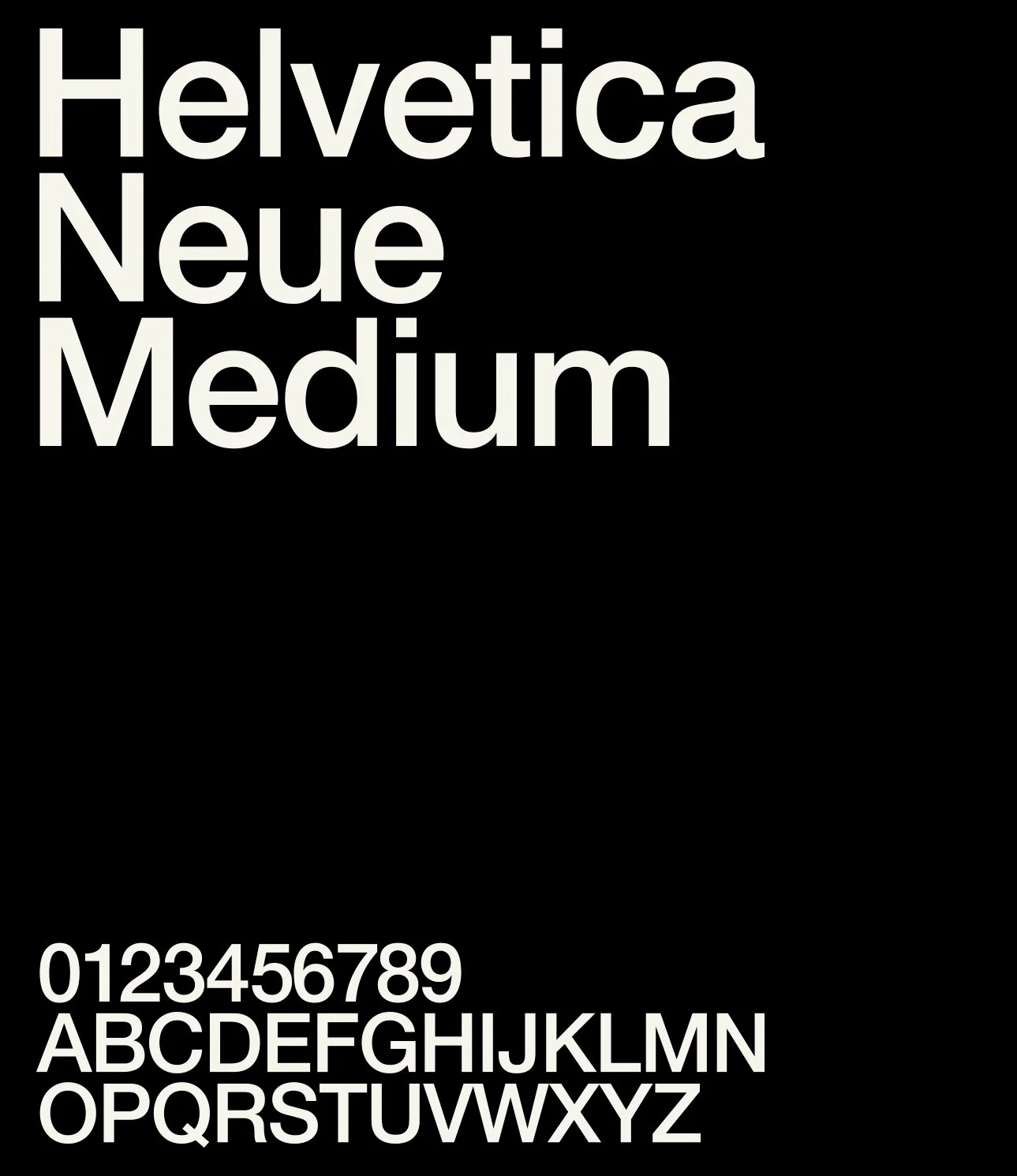
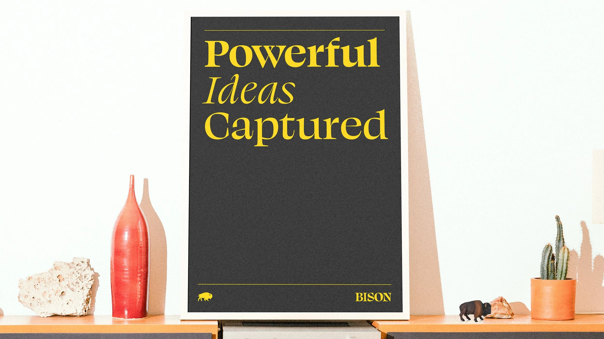
A flexible typographic system extends across website, social content, podcast formats, digital touchpoints and promotional applications, giving BISON a consistent presence while allowing the content and personalities to remain the focus.

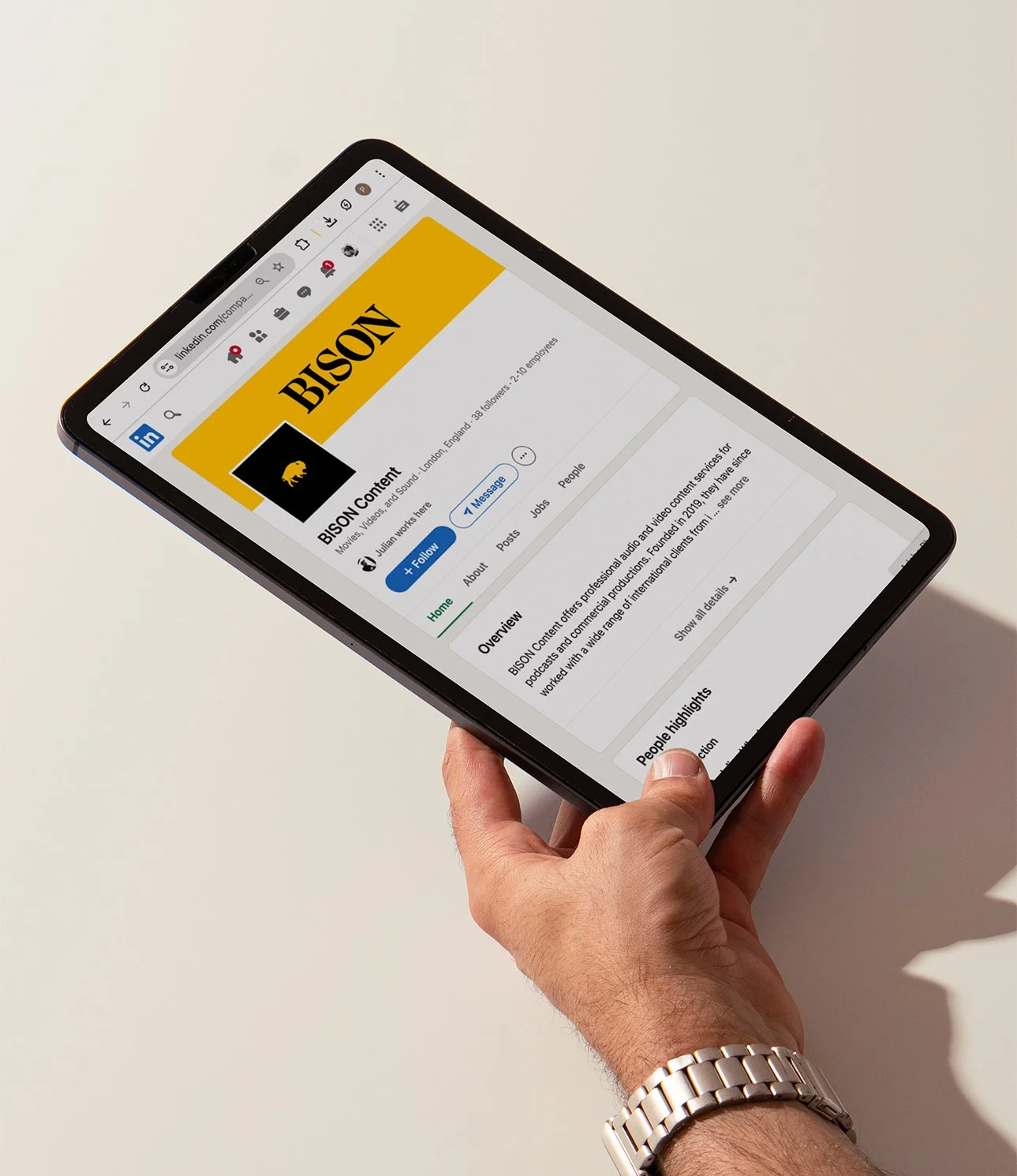
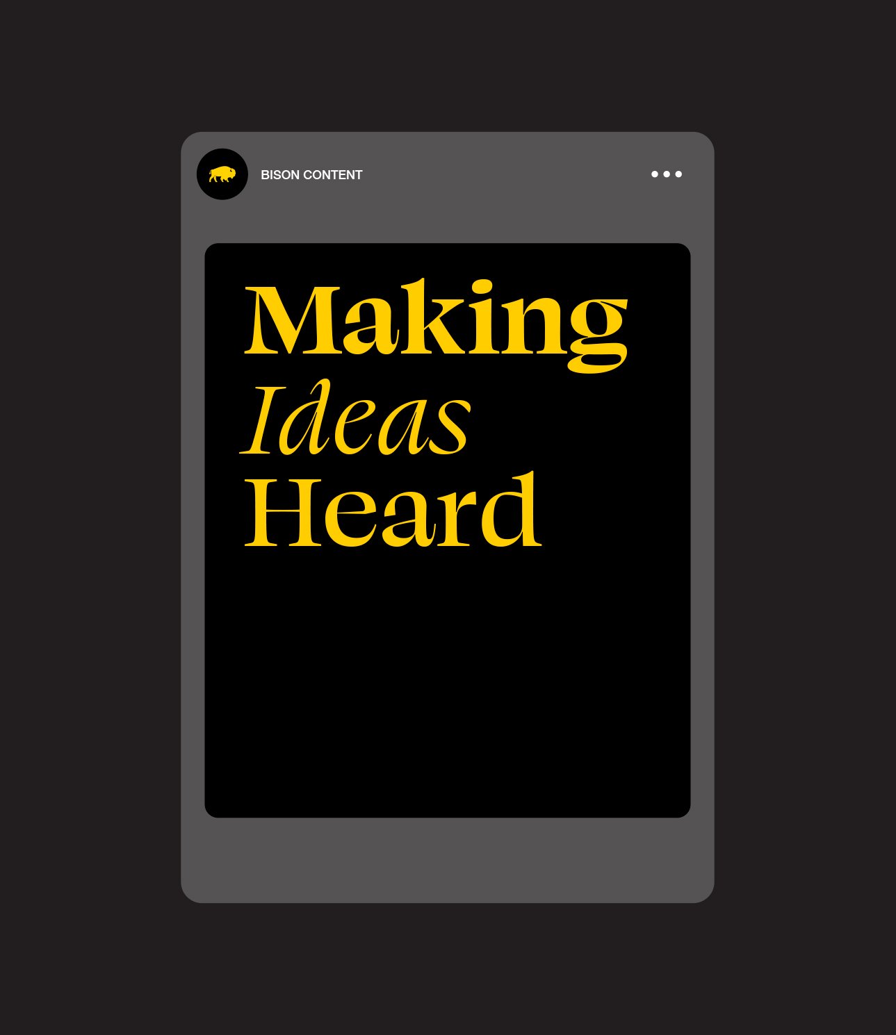
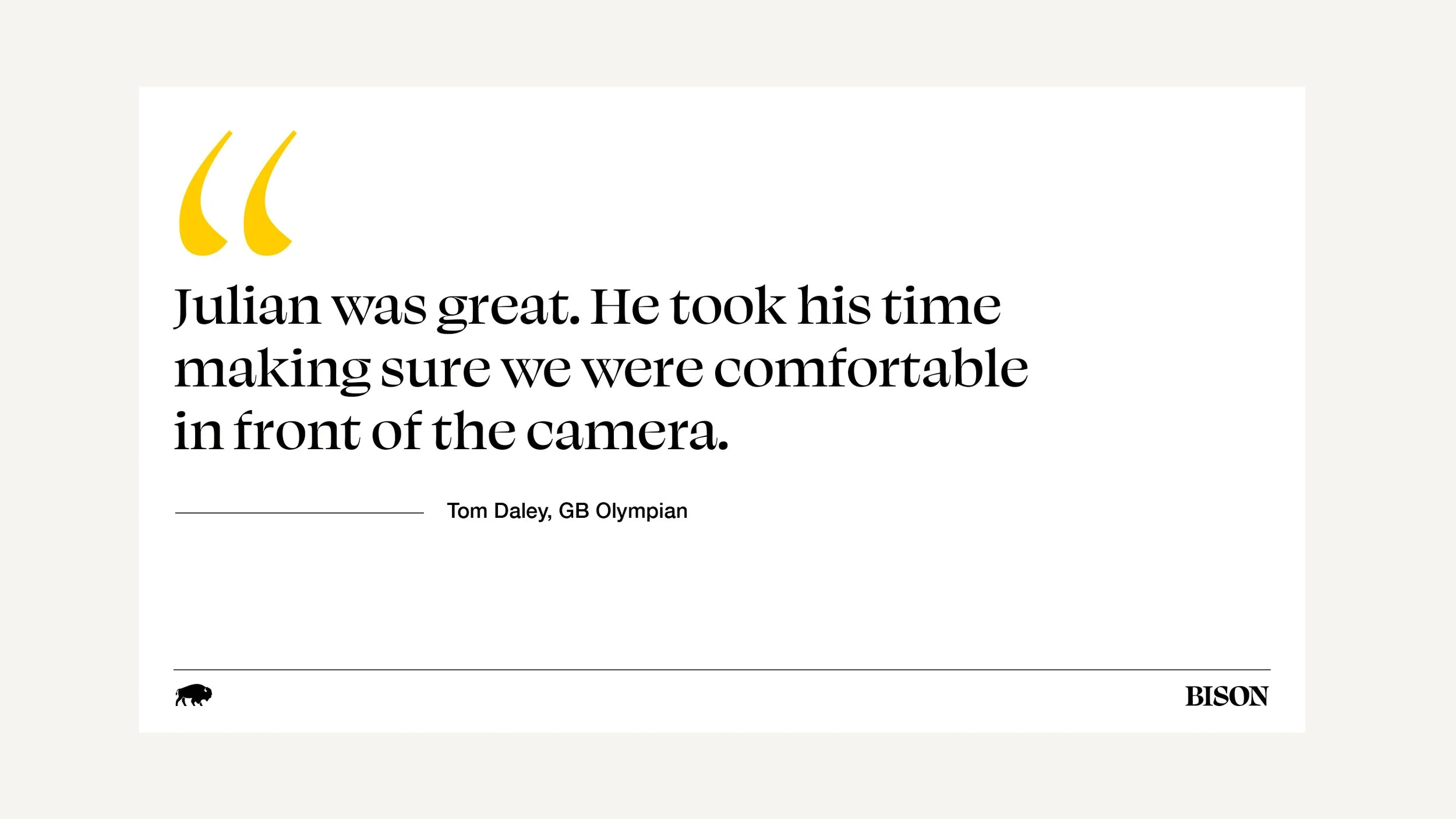
The new identity gives BISON the authority and confidence to match the ambition of the business, creating a stronger platform for the people who use the studio and positioning BISON alongside the industry voices it helps amplify.
BISON doesn't need to be the loudest voice in the room. It creates the room where great ideas get heard.

‘We'd outgrown the identity we started with. The new brand gives BISON the authority we've always wanted, without losing what made us different’
Julian Wharton
BISON, Founder